Monday, 31 October 2011

Greenwich Park

It's a very long time since I'd been to Greenwich Park so it was lovely to spend the afternoon there on Thursday. Having read a lot of the stuff that last years group did, it made it really interesting, especially looking at the areas they recommended for improvement. I liked the main house, large, spacious rooms with high ceilings and a great staircase, spiralling up, quite impressive,

Looking up through the centre of the spiral staircase

A beautiful old tree

I wonder if the architects had to do an elevation from the top of this hill as part of planning approval for the City!
Marian gave good constructive feedback on the group document and now it's time to press on with the CMP, this week is writing the statement of significance so need to crack on...

Wood Wharf review

Tutorial went well on Friday, Paula had a lot of constructive comments and I spent time at the weekend working through them and making revisions. Today Julia looked through the revisions and made a few more comments, so I'm really pleased as I can crack on with the final design and then get some good graphics together. I changed my mind on the shape of the trees and have gone for fastigiate as they will work better with the other shapes.
Sketch showing trees in planters to match shape of main sculpture feature, positioned in front of seating and glass screens

Thursday, 27 October 2011

Wood Wharf Ideas

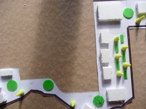
Before we had our Model Making intro on Monday I'd already been out and bought some playdo, I know this isn't high tech but it's quite easy to mould (well it is for ages 3+). I can't wait to do a model in the model shop, all those tools and machines... 
So I developed the ideas that came out of last weeks tutorial and came up with a design plan. The title for my design is 'A Natural Reflection'. The two areas we are designing are very different, one quite stark and modern and the other quite natural; with all the water and glass there is reflection and so I felt the title united the two parts. 
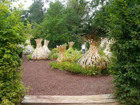
There will be tall highly polished steel sculptures which I originally thought would be tall and slender but Paula raised a good point about their stability and to think about a wider base, so I then thought about the onion shapes in Chaumont although on a much larger scale. Also to give them have a purpose so I thought they could be made into seats. The top of each sculpture will have down facing spotlights to cast shards of light at night.


Original thoughts, to have tall, slender columns
Changed the shape to onion but keeping them tall and having seats in them, you need to imagine these are steel and not bright yellow
In the sunlight they'll cast striking shadows at certain times of day
An idea of the steel sculptures with the seat inset and going all the way round
The lattice onion shapes from one of the Chaumont show gardens - at night this garden looked great, the onions were lit up from the inside and cast beautiful shadows with the light
The design also gives reference to the olympics with the layout in the centre part as 5 piece grid. As one arrives in the space off the footbridge there is an angular covered walkway lined with Betula in wooden planters. This is repeated in front of the multiscreen TV under the circle. Along the bottom north side there are coloured perspex screens etched with previous olympians in action, larger than life. These are repeated at the top west edge with the names of all the countries taking part in 2012. Not finished yet but as the design moves into the natural side so the shapes will become more organic and the design will have a softer feel. Get some feedback in tutorial tomorrow and then try to get the plan finished, next step will be to bring it to life in Sketch up and Photoshop, both new programmes for me, doing ok so far with Photoshop (I think) so looking forward to getting my brain round Sketch Up.

Saturday, 22 October 2011

The Red House

A very enjoyable morning spent at the Red House, which was once the home to William Morris and his family. How lovely to find an oasis in the middle of a built up, urban area. The garden was interesting in that the orchard felt quite wild and neglected whereas other areas were more orderly and cared for. It gave a really good feeling of rooms and different spaces in the garden,
Our guide was great, his enthusiasm and knowledge added a huge amount to the visit. Inside the house it lacked warmth - I don't just mean hot radiators - it could be brought more to life, probably in the way Standen has been. It is a relatively new acquisition by the NT so maybe there are plans to add artefacts etc, in the future.

The Red House
The afternoon was good, we all presented our A1 historical layer posters for Knole, it brought the whole story to life, I think the exhibition will look good with the final pieces of work.

The first hand in as well, the A3 research document was completed and handed over to Marian along with a digital copy. A group project that came together really well in the end. We have learnt things from it - timing, communication, software issues, roles - which we can use in our next group project.

Tuesday, 18 October 2011

Eastbourne - Sovereign Park

I'm wondering if the overall theme for this year is wind.

Interesting visit to Eastbourne, last time I was there it was on the bike, a beautiful hot sunny day and it was packed with people, it couldn't have been more different to yesterday. I love the sea, whatever the weather, it's completely invigorating.

Included a few photos, it'll be good to capture the different moods as the winter draws on.


Photoshop - bucketfill

I've been playing with colour swatches and bucket filling. I can see this has amazing potential. I need to adjust the swatches. In a large area the fill is in a sequence of squares, this is particularly evident in the sky and the grass (picture below). I guess I need to make sure the original swatch is more even on the edges rather than fading out slightly, Jamie will probably talk us through this a bit more. I need to look at some of the things like tools preferences and feather brush that Jamie mentioned to enhance what I'm doing. But for first attempt I'm quite pleased. 
Model filled with own colour swatches

Quick sketch filled with own colour swatches using bucketfill

Monday, 17 October 2011

Colours

I did three sets of colour swatches using different mediums; Crayons and pastels, Felt Tip, Watercolour. I then scanned them and printed them out and was pleasantly surprised by how near they were to the originals. I'll also try printing them at Uni to see how the colours work there. I like the crayon and pastel and the watercolour; my least favourite is the felt tip, it seems a little heavy although I am sure there will be times when that is useful.


Interesting, looking at them posted here the felt tip looks ok, in fact better than the pencil. I'll colour some sketches in and experiment.